
Shine Sports Web Design
Page Contents
1. Project Overview
2. Understanding the user: User research, Persona, Problem statement, User journey map
3. Starting the design: Paper wireframes, Digital wireframes, Low-fidelity prototypesprototypes, Usability studies
4. Refining the design: Mock-ups, High-fidelity prototype, Accessibility
5. Conclusion: Takeaways, Next steps
1. Project Overview
The product:
Shine Sports offers affordable clothing, attracting primarily youth, including college students and new professionals.
The problem:
The websites has crowded layouts, ineffective product browsing tools, and complex checkout procedures.
The goal:
Create a user-friendly website by delivering simple checkout procedures and providing straightforward navigation.
My role:
UX designer re-designing a website for Shine Sports.
Responsibilities:
Conducting interviews, paper and digital wireframing, low and high-fidelity prototyping,
conducting usability studies, accounting for accessibility, and iterating on designs.
Getting Started
I performed user interviews to better comprehend the desired user and their needs, and I then put those interviews into empathy maps.
Many of my target customers view online shopping as a pleasurable and soothing hobby when they need a break from school or work.
Nevertheless, many shopping websites are difficult to browse and can be overwhelming, which frustrates many of the target users.
This made an activity that would typically be enjoyable for them hard, undermining the objective of relaxing.
2. Understanding the user
User research: pain points
1. Navigation: The layout of shopping websites is frequently cluttered, which makes it difficult to navigate.
2. Interaction: Slight buttons on shopping websites make it harder to choose an item,
which occasionally causes users to make mistakes.
3. Experience: Several websites for online shopping don’t offer an enjoyable way to browse.
 Meet the users
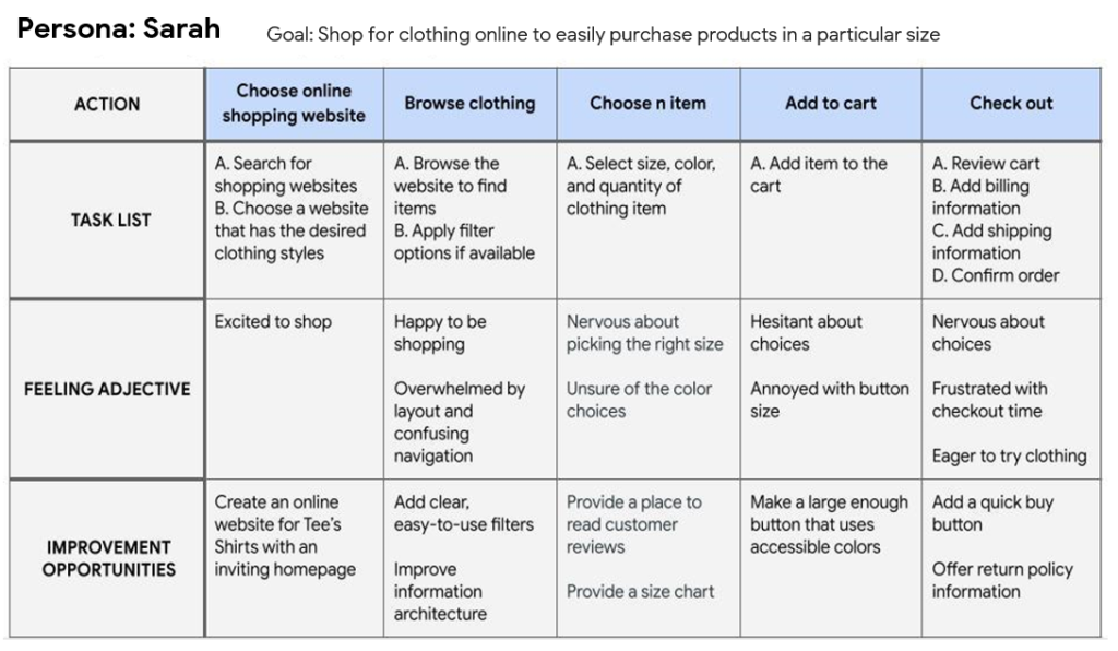
Persona: Sarah
Problem statement:
Sarah, a busy college student, seeks a website with simple navigation and search options for worry-free online shopping.

User journey map
The user journey map for Sarah showed how beneficial it would be for users to have access to a Shine Sports website.
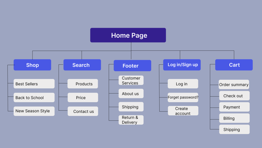
Sitemap
Using this information, I developed a sitemap to address users’ main pain point of website navigation.
My goal was to make informed information architecture choices to enhance overall navigation, opting for a straightforward framework.
3. Starting the design
Paper Wireframes
Crafting paper wireframes for each website page, I prioritized user navigation and focused on enhancing the home page browsing experience.

Digital Wireframes

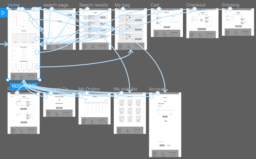
Low-fidelity prototype
I linked each screen in the main user flow for adding an item to the cart and checking out to develop a low-fidelity prototype.
Team members provided input on my designs, including button placement and page organization.
I noted their suggestions and implemented those that addressed user frustrations.
Usability Study
I conducted two rounds of usability studies. Findings from the first study helped guide the designs from wireframes to mockups.
The second study used a high-fidelity prototype and revealed what aspects of the mockups needed refining.
After analysis, the data were categorised into themes. I developed a high-fidelity version of the website with the following modifications:
First Usability Study
The first usability study was an unmoderated usability study with 5 participants.
The session lasted approximately 20 minutes and was broken up into three parts:
basic, closed-ended questions, open-ended questions, and a system usability scale. The findings included:
– Users want to change the number of products in their cart.

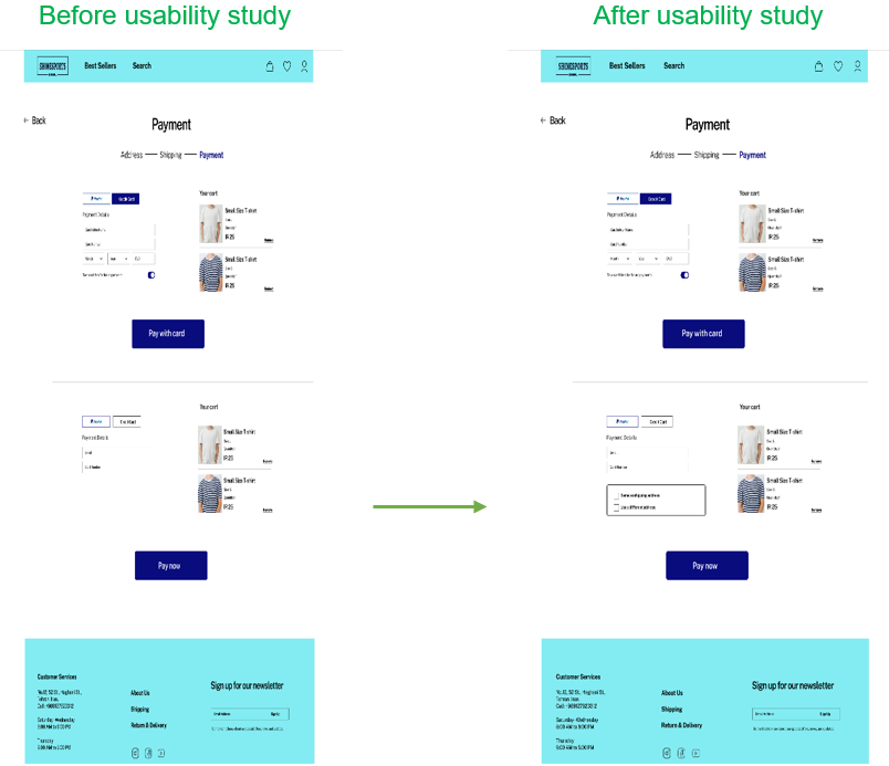
Second Usability Study
I conducted a second usability study on the high-fidelity mockups with 5 participants, also an unmoderated session.
Each 20-minute session included general closed-ended questions and open-ended inquiries. The findings comprised:
– Users want to have an option for a shipping address to avoid repeat to entering the address and having a smooth process.
Users could now use the same address for both shipping and billing, which I included as a check box to further simplify the checkout process.
4. Refining the design
High-fidelity prototype
The high-fidelity prototype followed the low-fidelity version’s flow and included major design improvements from the usability study.

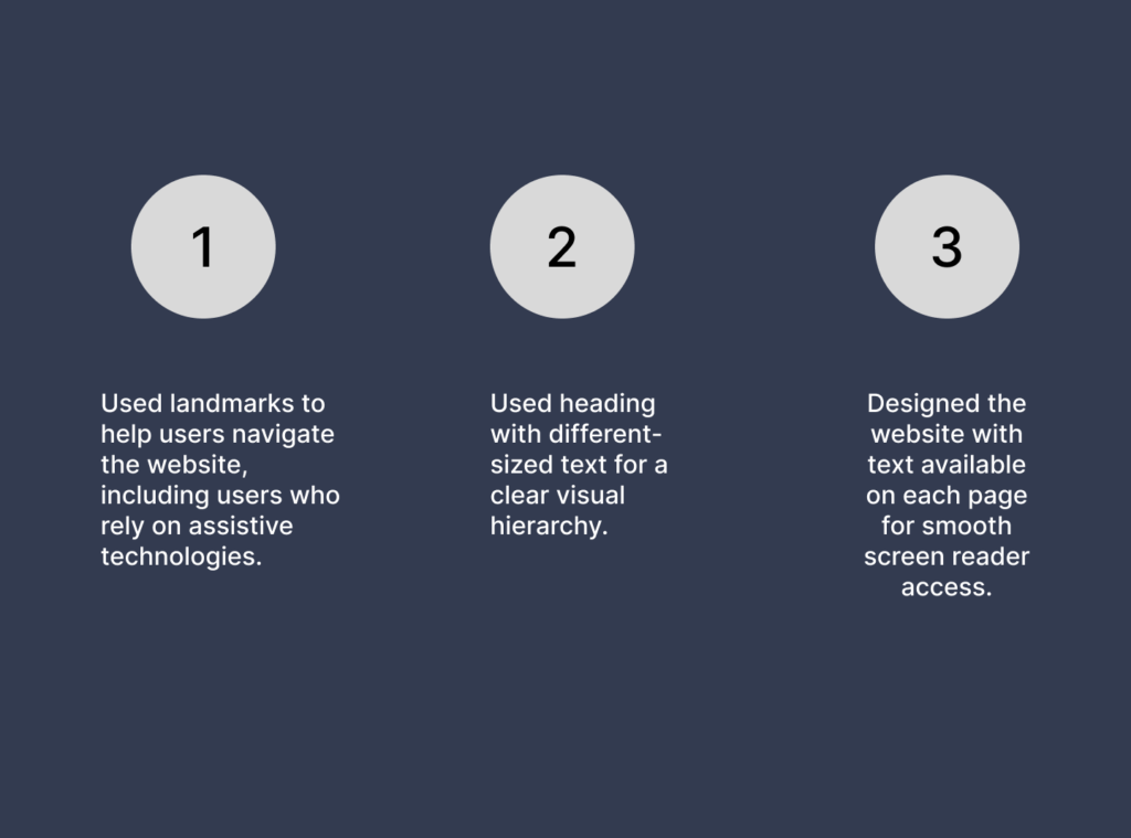
Accessibility considerations
1. Used landmarks to help users navigate the website, including users who rely on assistive technologies.
2. Used heading with different-sized text for a clear visual hierarchy.
3. Designed the website with text available on each page for smooth screen reader access.
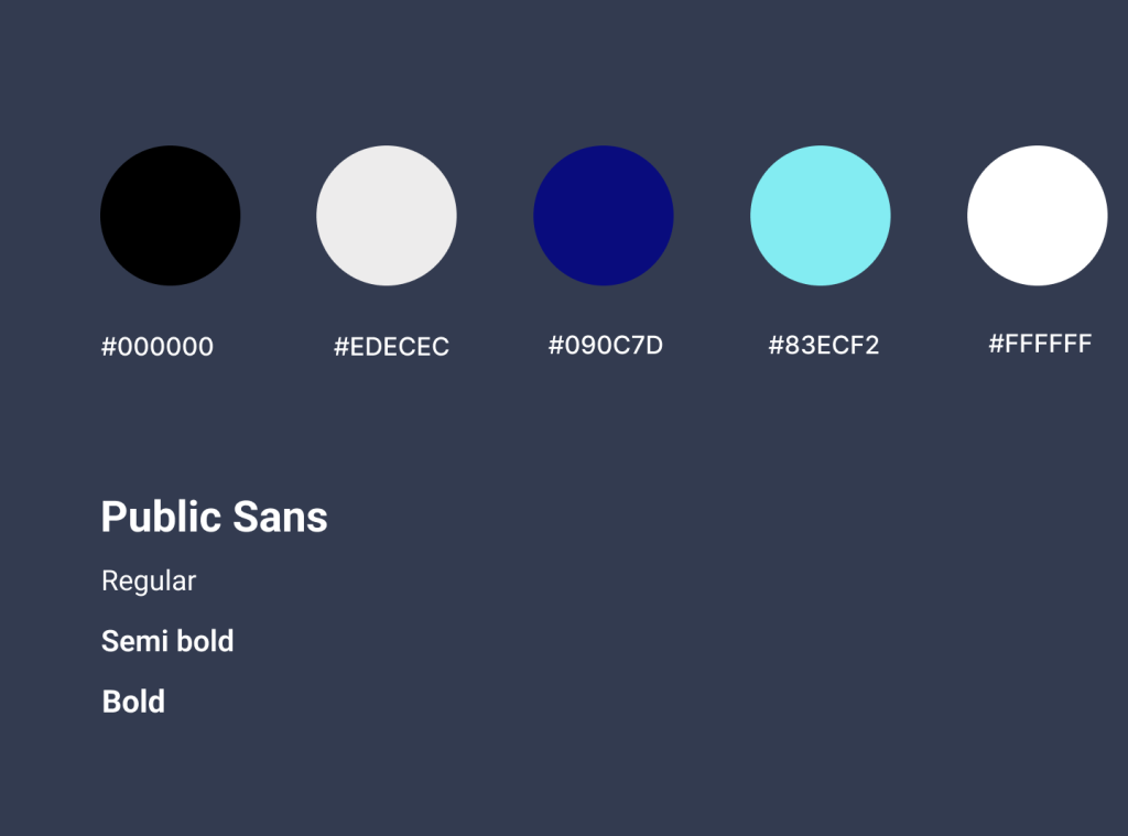
Style Guide
5. Conclusion
Takeaways
I discovered that even minor design adjustments can significantly affect the user experience,
emphasizing the importance of always keeping the user’s actual demands in mind when developing design concepts and solutions.
Next steps:
More user feedback should be gathered, consumers should be kept involved in the process.