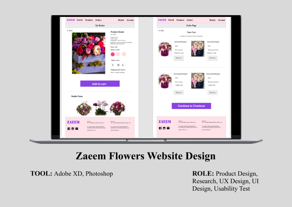
Zaeem Flowers Website Design
Page Contents
1. Project Overview
2. Understanding the user: User research, Persona, Problem statement, User journey map
3. Starting the design: Paper wireframes, Digital wireframes, Low-fidelity prototypesprototypes, Usability studies
4. Refining the design: Mock-ups, High-fidelity prototype, Accessibility
5. Conclusion: Takeaways, Next steps
1. Project Overview
The product:
Zaeem Flowers attempts to provide a variety of bouquet flowers for the situations and purposes of their customers.
It offers a wide range of pricing and provides occasional and seasonal bouquets for its customers.
The problem:
Busy customers who lack the time to order the bouquet for a specific purpose and time by phone call or in person.
The goal:
Design a website for the Zaeem Flowers brand that allows users to order online the bouquet through the website quickly and deliver them.
My role:
UX designer designing a website for Zaeem from conception to delivery.
Responsibilities:
Conducting interviews,
paper and digital wireframing,
low and high-fidelity prototyping,
conducting usability studies,
accounting for accessibility,
and iterating on designs.
Getting started:
I began by posing some fundamental questions to myself, including these:
“What is the product and who is it for?”
“Who do I see as our biggest competitors?”
“What do our primary users need the most?”
2. Understanding the user
User research: pain points
1. Time: Busy managers do not have enough time for ordering the bouquets in person or phone call.
2. Accessibility: Platforms for ordering bouquet flowers are not equipped with assistive technologies.
3. Availability: Customers like managers who want to order bouquets for specific situations and send them at specific time.

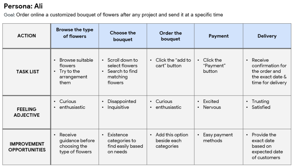
Meet the users
Persona: Ali
Problem statement:
Ali is a manager. He is working at an international firm and he has a busy plan.
He has a regular plan to send the bouquet flowers to contractors after completing any projects in a specific time.
Ali has mild color blind and prefers to choose customized orders related to his need.

User journey map
Mapping Ali’s user journey revealed how helpful it would be for users to have access to a website of ZAEEM Flowers.
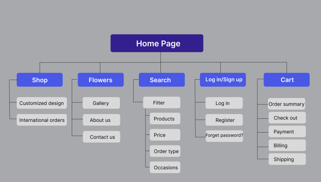
Sitemap
Here, I wanted to use information architecture to make smart choices that would ensure better website navigation.
I selected a framework with an emphasis on accessibility and simplicity.
3. Starting the design
Paper Wireframes
The elements that made it to digital wireframes were selected because they would be most suited to solve user pain points
because time was taken to write iterations of each website screen on paper.

Digital Wireframes
As the initial design phase continued, I made sure to base screen designs on feedback and findings from user research,
included explanation about selected product , and the color of flowers used in the bouquet.


Low-fidelity prototype
I created the low-fidelity prototype so that I could collect comments from my team on areas like icons and other pages.
Usability Study
I decided to carry out a usability study on the high-fidelity mockups and test the app’s visual design.
After analysis, the data were categorised into themes. I developed a high-fidelity version of the website with the following modifications:
Usability Study
The usability study was an unmoderated usability study with 5 participants.
The session lasted approximately 20 minutes and was broken up into three parts:
basic, closed-ended questions, open-ended questions, and a system usability scale.
The findings included:
– Users want to see similar items based on chosen product(s) in the basket.
– Users want to remove selected product in cart page.
Most users had trouble removing the chosen item from their cart.
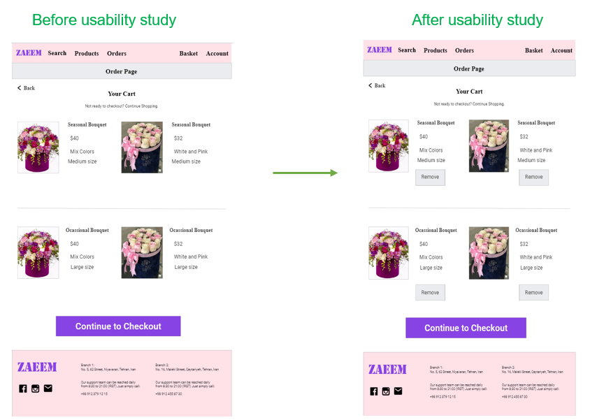
Most users wanted to see similar items based on their chosen product in the basket.

4. Refining the design
High-fidelity prototype
In order to meet the user needs, the final high-fidelity prototype presented cleaner user flows for ordering the bouquet and checkout.

Accessibility considerations
1. Used heading tags for each section that provided access to users who are visually impaired and they need to use a screen reader.
2. Used detailed imagery for each item and explanation about products such as size, color,
and guidance about suitability for different kinds of purposes that help all users better understand the design.
3. Used icons to help make navigation smoother.

Style Guide

5. Conclusion
Takeaways
I just employed Adobe XD for this project. Even though I was able to finish my entire design in Figma,
it is useful to be familiar with all of the common tools used in the field.
Next steps:
I gained more knowledge about this project and decided to adhere to:
the research, definition, ideation, prototype, and iteration steps of the UX design process.