Meet the users
Persona: Maria
Problem statement:
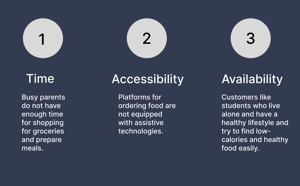
Maria is a full-time fitness student who lives alone and needs easy access to low-calories anlow-caloried healthy food ordering options because she has no skill and time to prepare meals.

Persona: Michael
Problem statement:
Michael is a busy working father who needs easy access to healthy food ordering options because he has no time to cook dinner for himself and his son.

User journey map
Mapping Michael’s user journey revealed how helpful it would be for users to have access to a dedicated Roysa Cafe app.

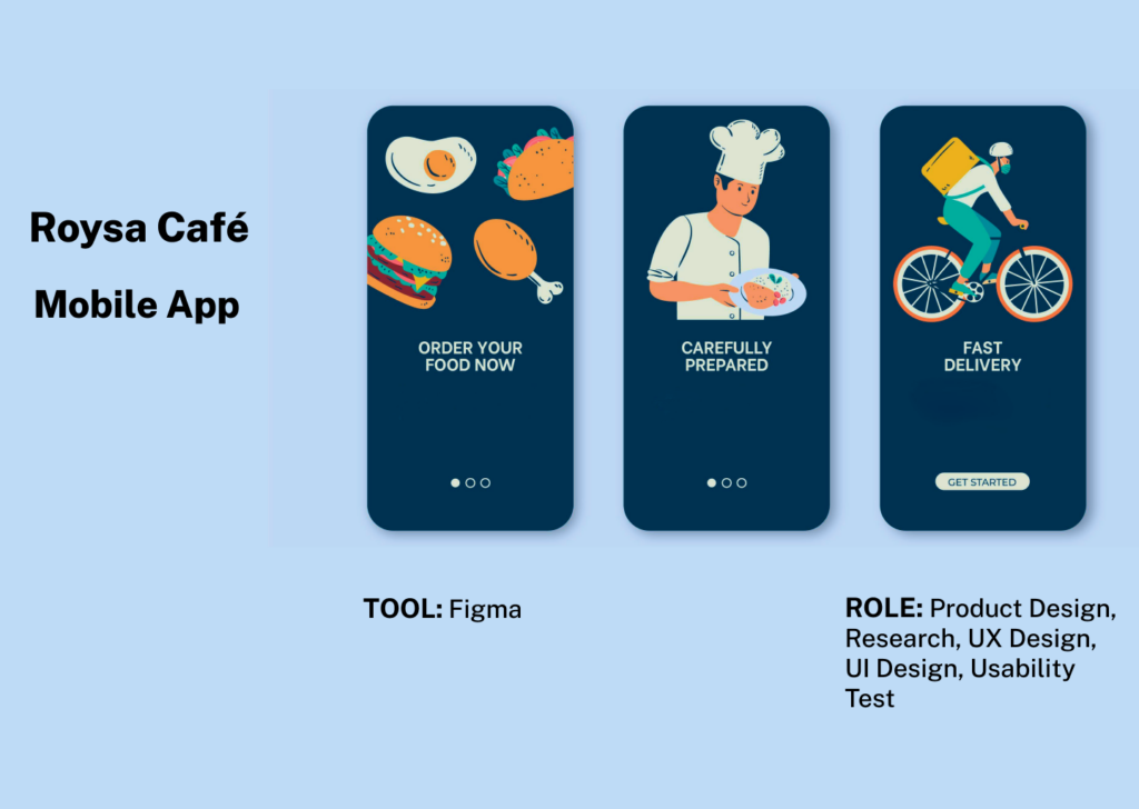
3. Starting the design
Paper Wireframes
Taking the time to draft iterations of each screen of the app on paper ensured that the elements that made it to digital wireframes would be well-suited to address user pain points.

Digital Wireframes
As the initial design phase continued, I made sure to base screen designs on feedback and findings from user research.

Tracking the order was a key user need to address in the designs in addition to equipping the app to work with assistive technologies.

Low-fidelity prototype
Using the completed set of digital wireframes, I created a low-fidelity prototype. The primary user flow I connected with was building and ordering a healthy meal, so the prototype could be used in a usability study.

Usability Study
I conducted two rounds of usability studies. Findings from the first study helped guide the designs from wireframes to mockups. The second study used a high-fidelity prototype and revealed what aspects of the mockups needed refining. After analysis, the data were categorised into themes. I developed a high-fidelity version of the app with the following modifications:
First Usability Study
The first usability study was an unmoderated usability study with 5 participants. The session lasted approximately 15 minutes and was broken up into three parts: basic, closed-ended questions, open-ended questions, and a system usability scale. The findings included:
- Users want to use the search bar easily.
- Users want side dish options on the same page.
- Users want to use create the profile easily.
Most users had trouble finding the profile icon in order to create a profile and the search bar did not have enough space for typing easily on it. The search bar needs a large size to use easily.

Most users want to add side dishes on the same page for adding to their order.

Second Usability Study
I decided to carry out a second usability study on the high-fidelity mockups and test the app’s visual design despite the fact that there weren’t many modifications made during the low-fidelity phase in order to see if it connects with the community I am creating for. With 5 participants, this study was also an unmoderated usability study. A 15-minute session was divided into two parts: general questions with closed-ended answers and open-ended questions. The findings comprised:
- Users cannot see the price per meal until the end of the order process.
- Users want to see other users’ previews for each meal.
Most users want to see the price per meal on the home page and other users’ previews for each meal.

4. Refining the design
High-fidelity prototype
The final high-fidelity prototype presented cleaner user flows for building a healthy meal and checkout. It also met user needs for a delivery option as well as more customization.


Style Guide

5. Conclusion
Takeaways
While designing the Roysa Café app, I learned that the first ideas for the app are only the beginning of the process. Usability studies and peer feedback influenced each iteration of the app’s designs.
Next steps
Conduct more user research to determine any new areas of need.